Australians love property. Shares have long been a mainstay of superannuation. Cash feels safe. And gold and silver are often treated as something sitting off to the side.
So this updated chart from Ainslie Wealth is worth a look.
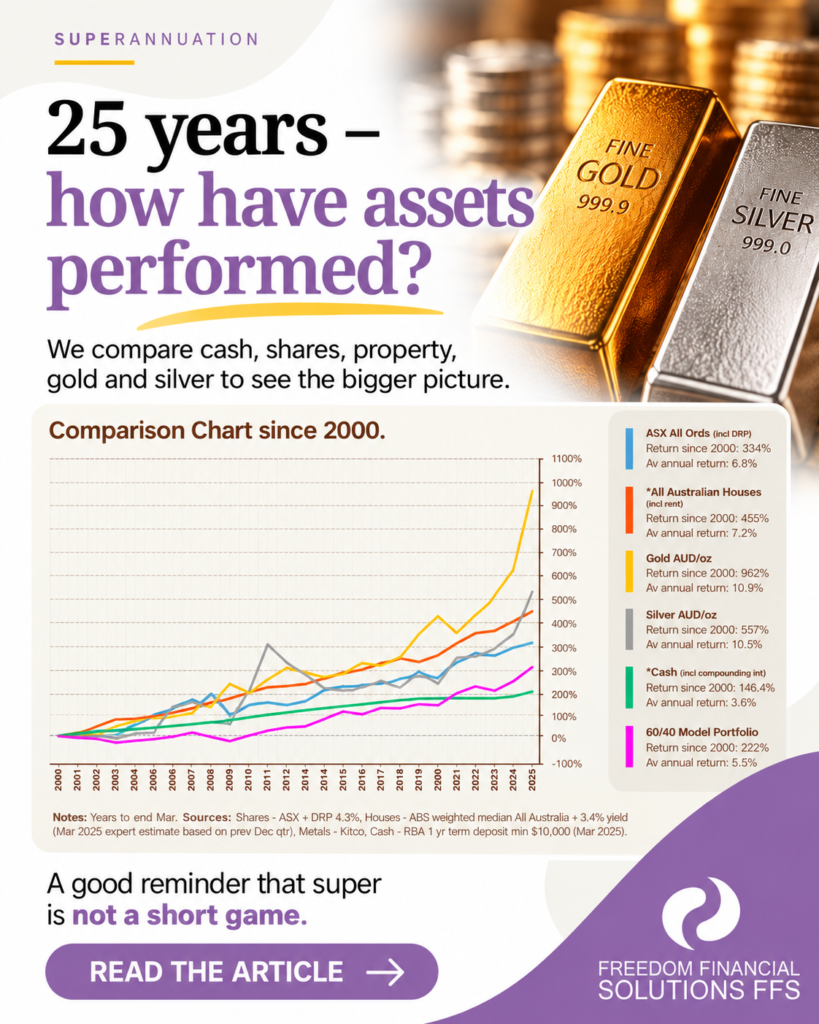
It compares six different investments from 2000 to March 2025. Importantly, it doesn’t simply compare house prices with gold prices. The property figure includes rental income, the sharemarket figure includes reinvested dividends, and cash includes compounded interest.
And the results might surprise you.
According to the chart, over the period shown gold returned 962%, an average annual return of 10.9%, while silver returned 557%, averaging 10.5% a year.
Australian houses, including rental income, returned 455%, or 7.2% a year, while the ASX All Ordinaries including reinvested dividends returned 334%, averaging 6.8%. The 60/40 model portfolio returned 222%, while cash including compounded interest returned 146.4%.
But look at the journey
The really interesting part of the graph isn’t simply which line finished highest.
Look at silver. It delivered a strong long-term result over the period shown, but getting there was anything but smooth. Gold had substantial falls too. Property and shares experienced their own periods of stronger and weaker performance.
That’s an important reminder when investing your super. An investment that performs strongly over 25 years won’t necessarily feel like a strong investment during every one of those years.
And there is another important point. This chart stops at March 2025. It doesn’t capture the extraordinary moves we’ve subsequently seen in gold and silver. For example, Ainslie reports that Australian-dollar silver rose another 94% in the 12 months to March 2026. Ainslie Bullion
So what does the chart actually tell us?
It doesn’t tell us what to buy next.
What it does show is why long-term perspective matters. Different investments behave differently, sometimes dramatically so, and looking at the last six months or even the last few years can give a very different picture from looking across decades.
For an SMSF, the bigger question isn’t simply “Which line went up the most?” It’s why you hold each investment, how it fits with the rest of your fund and whether it remains appropriate for your long-term investment strategy.
That is a much more useful conversation than trying to pick tomorrow’s winner.
Chart courtesy of Ainslie Wealth. Returns shown are from 2000 to March 2025 and reflect the methodology stated on the chart. Past performance is not an indication of future performance. This article contains general information only and does not constitute financial, tax or investment advice.